10 CTA Best Practices to Fix Low Conversions

Discover 10 CTA best practices that can enhance your conversion rates. Learn effective strategies to optimize your calls to action-read more now!

A weak call-to-action (CTA) is like a door that never gets opened. If people aren’t clicking, something’s off. The wording might be vague. The CTA button might be buried. Or worse—there’s no real reason to click.
The fix? Small but intentional tweaks. Here’s how to get your CTA working like a magnet:
- Clarity wins – No guesswork. Make the action obvious.
- Friction kills – Fewer steps = more conversions.
- Urgency sells – Give them a reason to act now.
Let’s fix that CTA with the best practices listed below.
TL;DR
- CTAs are crucial for engagement and conversions – A well-placed CTA reduces decision fatigue and reinforces your value proposition.
- Best practices for high-performing CTAs – Use action verbs, keep CTA text concise, and enhance visibility with contrasting colors and white space.
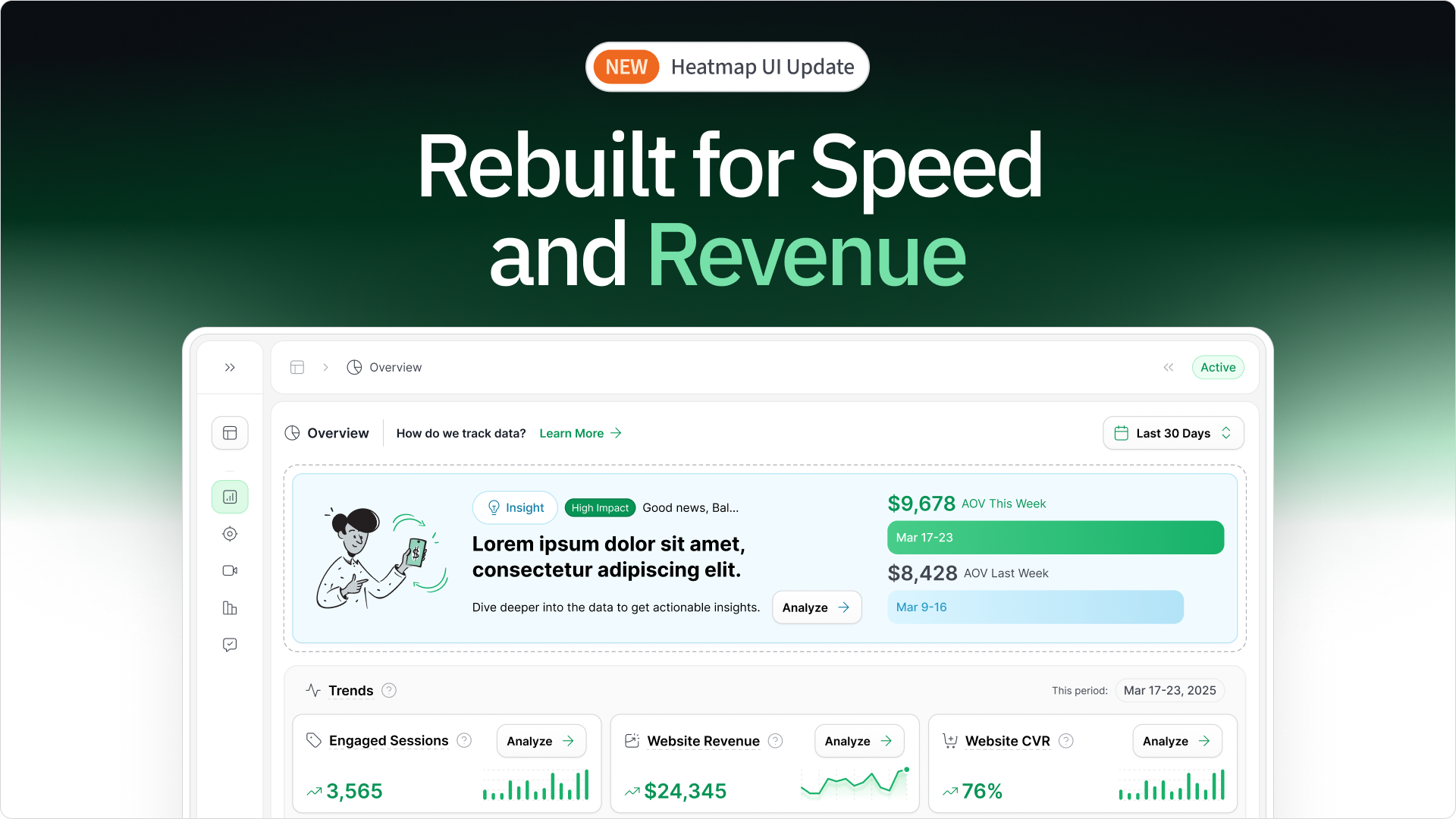
- heatmapAI optimizes CTA performance – heatmapAI provide revenue-based analytics, CTA tracking, and user behavior insights to maximize conversions.
- Learn from top brands – Case studies from JD + Kate Industries, AirHelp, and Sentry highlight effective CTA strategies that drive engagement.
- Test and refine – Regularly analyze CTA performance, tweak button text, and optimize placement across web pages for maximum impact.
Reasons CTAs Are Crucial for Boosting Engagement and Conversions
A CTA is more than just a button—it’s what moves users from browsing to action. Its placement, wording, and design can make the difference between a lost opportunity and a conversion. By following CTA best practices and leveraging real data—like insights from heatmapAI—you can optimize CTAs to drive higher engagement and sales.
Here’s why CTAs are essential for conversion success:
Direct Users Toward Action: A CTA serves as a clear signpost on a landing page, telling users what to do next—whether that’s signing up, downloading a free template, or making a purchase. Without it, visitors are left to figure things out on their own, which rarely ends in a conversion.
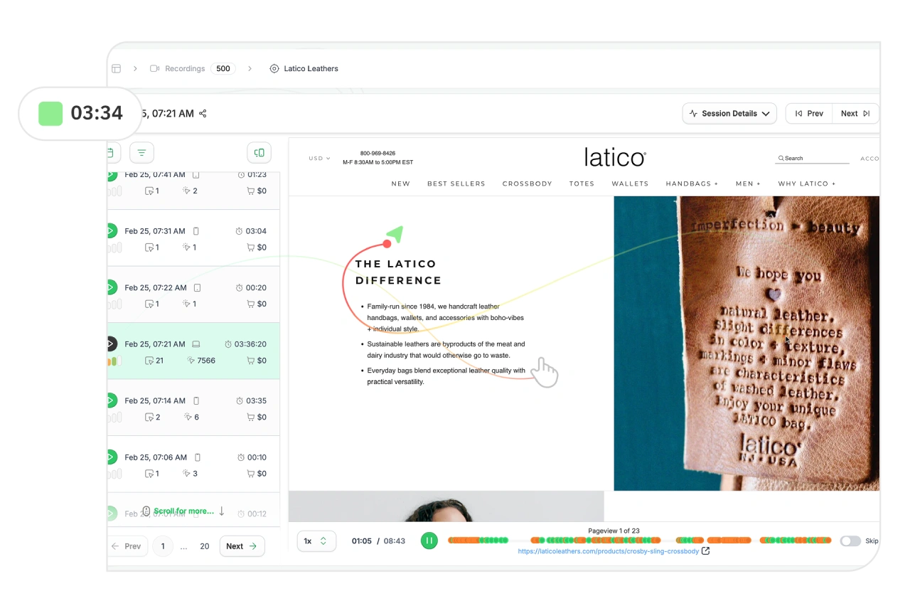
🔍 heatmapAI’s screen recordings give businesses a clear view of how visitors interact with CTAs, making it easier to test, refine, and position them for maximum engagement.
Capture Users’ Attention: A compelling CTA needs to stand out visually. Using contrasting colors and action words can make a CTA more effective.
📌 heatmapAI’s scrollmaps reveal where users drop off on a web page, helping businesses optimize CTA placement to appear before engagement declines.

Reduce Decision Fatigue: When users don’t know what to do next, they’re more likely to leave without taking action. A strong CTA simplifies decision-making by providing a clear next step—eliminating hesitation and increasing conversions.
💡 heatmap.com's AI insights analyze how users interact with CTAs and provide data-driven recommendations to optimize wording, placement, and design—making it easier for your audience to take action.

Reinforce the Value Proposition: A good CTA does more than tell users what to do—it tells them why they should do it. Whether it’s “Download your free ebook” or “Get 50% off now”, the CTA should clearly highlight what users gain by taking action.
🛠️ heatmapAI’s AI-generated recommendations provide complete CTA optimization, refining text, placement, and design to maximize engagement and conversions.

A high-converting CTA isn’t just about the words—it’s about strategic placement, clarity, and delivering real value. With HeatmapAI’s analytics, you can optimize every element to seamlessly guide visitors toward action and increase conversions.
10 CTA Best Practices for Maximizing Conversions
A call-to-action (CTA) isn’t just a button—it’s the tipping point between a visitor leaving or converting. If a CTA is unclear, hard to find, or unconvincing, users won’t take action. But when designed strategically, CTAs grab attention, eliminate hesitation, and boost conversions.
1. Use Action-Oriented Language
Avoid passive language. A call to action button should tell users exactly what to do. Words like "Get," "Download," "Subscribe," and "Start" make the next step obvious and encourage quick decisions.
For example, instead of "More Information", try "Get Your Free Ebook Now"—it’s clear, specific, and action-driven.

2. Keep It Short and Focused
A good CTA doesn’t need too many words—just a few words that communicate the action and benefit.
🔍 Compare:
❌ "Sign up for our exclusive newsletter to receive the latest industry insights and updates."
✅ "Sign up for weekly insights."
Short, clear CTAs = less friction, more clicks.

3. Make CTAs Stand Out Visually
A compelling CTA should be optimized for mobile devices and designed to immediately draw attention. Use:
- Contrasting colors (Orange button on a blue background = hard to miss)
- Bold CTA button text with power words
- White space to avoid clutter

4. Add Urgency or Scarcity
Creating FOMO makes users act fast.
- "Only 5 Spots Left!"
- "Offer Ends Tonight!"
- "Last Chance – Download Now!"

5. Test and Optimize Regularly
A/B testing is key to optimizing CTAs. Experiment with:
- Button text (e.g., "Try for Free" vs. "Get Started")
- CTA placement (e.g., top of the landing page vs. middle or end of the page)
- Design elements (size, font, color)
Testing different variations helps identify what drives the most clicks and conversions.)
🚀 heatmapAI’s A/B testing tool analyzes how different CTA elements—such as size, color, and wording—impacts performance, helping brands optimize for maximum conversions.
6. Place CTAs in Strategic Locations
Where you place a CTA matters. High-performing spots include:
📍 Above the fold – Users see it instantly
📍 End of the page – When readers are primed to take action
📍 Within a pop-up – Great for time-sensitive offers

📊 heatmapAI’s scrollmaps show where users drop off, helping brands place CTAs in high-conversion areas.
7. Add Supporting Text Leading to CTA
A CTA’s purpose is clearer when preceded by supporting text, as users need persuasion before clicking.
Compare:
❌ "Get Started"
✅ "Grow your email list—get started for free."
8. Use Social Proof Before the CTA
People trust other customers more than ads. Build credibility by adding:
✔️ Testimonials – “This tool doubled my conversion rates.”
✔️ Stats – “Trusted by 10,000+ businesses.”
✔️ Customer Logos – Showcase brands that use your product
Social proof reassures users and boosts conversions.

9. Avoid Multiple CTAs on One Page
Too many CTAs = confusion.
❌ "Sign Up" + "Download Now" + "Start Free Trial" (Users won’t know what to do.)
✅ One primary CTA + one secondary CTA (e.g., "Start Free Trial" with "Learn More" underneath.)
10. Align CTA with the Target Audience
A great CTA speaks directly to what the audience cares about. It should address their challenges and clearly show how taking action leads to their desired outcome.
🛒 Ecommerce CTA: "Add to Cart – Get 20% Off Today"
📩 Email marketing: "Get Weekly Growth Hacks"
📊 B2B SaaS: "Book a Free Demo"

By understanding CTA best practices, brands can improve user engagement, increase conversions, and reduce friction.
Struggling with Conversions? Use heatmapAI to Achieve Higher ROI

Brands know CTAs are crucial, but many still struggle to turn clicks into conversions. Even with a well-designed landing page and steady traffic, the real challenge is understanding how users interact with your CTAs and why they hesitate to convert.
That’s where heatmapAI comes in. Unlike traditional analytics tools, heatmapAI tracks every click, scroll, and interaction, linking them directly to revenue. It provides deep insights into user behavior, showing you exactly where your CTAs are working, where they’re falling short, and what changes will drive higher conversions.
heatmapAI is known to drive millions for eCommerce brands
- JellyBee: Increased their conversion rate by 24.7% and total Annual Revenue over $650,000.
- Cooking Guild: Achieved an incredible increase in Revenue Per Session of nearly 50% on Collections Pages
Why teams choose heatmap.com over other analytics tools

Key Features - How heatmapAI Helps Boost Conversions
- Revenue-Based Heatmaps: View revenue tied to every click on each element, providing clear insights into the financial impact of user interactions. Custom filters allow analysis by behavior, average order value (AOV), traffic source, and more.
- AI-powered CRO engine: Over 500 AI-driven recommendations are available to enhance copy, rearrange page elements, improve visuals, and optimize other on-page elements to boost revenue per session.
- Dashboard & Metrics: Access key metrics such as revenue per session, scroll depth, and high-traffic pages in an intuitive dashboard, enabling quick analysis of website performance. Choose from over 12 filters, including custom options, to slice data by AOV, traffic source, session type, and more for precise insights.
- Comparison Mode: Compare different cohorts such as purchasers vs. rage clickers, high vs. low AOV customers, and new vs. returning visitors, supporting data-driven A/B testing and audience segmentation.
- Rage Click & Top Page Analysis: Identify high-engagement or problematic pages, using "rage click" insights to optimize user experience and reduce frustration.
Word on the Street About heatmapAI is...

With heatmap, I've been able to figure out what elements actually increase AOV and optimize our landing pages to drive more first purchase profitability, we're up 23% YoY.

Winning Split Tests #1 - Collection Page Optimization. +$71,286 per month in revenue with 97% significance.
1: Download heatmap.com
2: Wait for 5k sessions
3: Reorganize products based on the highest revenue per session from top left to bottom right.

Heatmap is a non-negotiable for all Ecom stores! Read this now!

Don't sleep on heatmap! You could be just a few tweaks away from changing the course of your business.
Adjust Your CTA Placement with heatmapAI's Insights
Heatmaps color-code your page based on user engagement:
🔴 Red areas = High engagement (Users frequently click here)
🟠 Orange areas = Moderate engagement
🔵 Blue areas = Low engagement (Users rarely interact here)
The redder the area, the more user focus it receives.
Once you identify high-engagement areas,
- Move your primary CTA into hot zones for better visibility.
- Use contrasting colors to make CTAs pop in high-traffic areas.
- A/B test CTA elements (text, design, and size) to find the best-performing version.
With heatmapAI’s real-time insights, you’re not just tracking clicks—you’re tracking revenue, ensuring CTA optimizations lead to measurable growth.
- Pricing: $117 USD/month for annual revenue between $0 – $4.9M
3 High-Converting CTA Examples from Leading Brands
The best CTAs stand out by using strategic copy, compelling design, and smart placement to increase engagement and drive conversions. Below, we’ll analyze three high-performing call to action examples from top brands and break down why they work so well.
JD + Kate Industries: A Bold, Attention-Grabbing CTA That Works
✅ CTA Placement: Exit-intent pop-up
✅ CTA Type: Lead to purchase

Why this CTA works?
- Interruptive and Commanding – The use of "WAIT" isn't a soft suggestion—it’s a command. It immediately halts users from leaving and forces them to reconsider their decision. Exit-intent pop-ups already work well for re-engagement, and this CTA takes full advantage of that.
- Curiosity-Driven Copy – The phrasing “Wait, you forgot to buy hundreds of candles” is dramatic, unexpected, and impossible to ignore. It creates a sense of FOMO, making users think: Did I actually forget something?
- Memorable and Over-the-Top – Instead of a standard “Don’t leave yet!” or “You have items in your cart,” this CTA leans into exaggeration. The phrase ‘hundreds of candles’ makes it stand out from typical exit pop-ups.
- Strong Lead Capture Strategy – The unusual and intriguing copy makes users more likely to pause and engage, increasing the chance of them entering their email—even if just to see what happens next.
A CTA that commands attention, triggers curiosity, and feels distinct from generic messages can stop users from bouncing and encourage re-engagement.
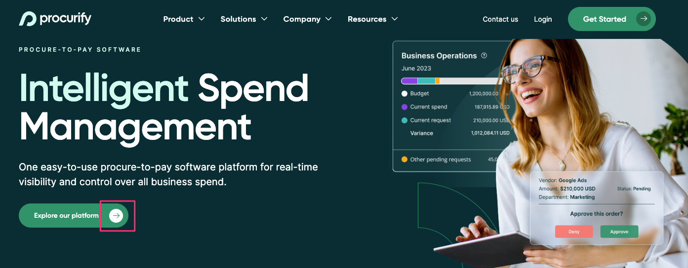
AirHelp: A Pain-Point-Driven CTA That Converts
✅ CTA Placement: Homepage header
✅ CTA Type: Lead to purchase
Why this CTA works?
- Directly Addresses a Pain Point – The question-based CTA “Did you have a delayed or canceled flight?” immediately triggers an emotional response. Anyone who has ever dealt with a flight delay or cancellation instantly relates to the frustration—making them more likely to engage.
- Clear Value Proposition – The follow-up statement “Get up to $700 compensation per passenger, no matter the ticket price” makes the benefit explicit. Instead of vague promises, it quantifies the potential gain, making it more tangible and enticing.
- Interactive & Engaging – The input fields for departure and destination airports make this CTA feel like a personalized experience rather than a generic offer. The simplicity of entering details lowers the barrier to action and increases engagement.
- Trust & Social Proof – Featuring a Trustpilot rating reinforces credibility and reduces skepticism. With 157,892 users already trusting AirHelp, the CTA subtly applies social proof to nudge hesitant users toward action.
- High-Contrast CTA Button – The “Check Compensation” CTA button is visually distinct, making it easy to locate while staying in line with the brand’s aesthetic. The clear, low-effort action phrase encourages users to click without feeling pressured.
A CTA that immediately resonates with users’ frustrations, provides a clear financial incentive, and incorporates interactive elements can significantly boost engagement and conversions.
Sentry: A CTA that Combines Humor and Action
✅ CTA Placement: Homepage.
✅ CTA Type: Lead generation / Free trial & Demo

Why this CTA works?
- Engages with Humor and Relevance – The CTA benefits from subtle animation where the word “breaks” literally distorts and becomes crooked. This quirky animation catches the eye and adds a playful, relatable touch for developers who deal with broken code daily.
- Uses Social Proof and Humor – The phrase "Tolerated by 4 million developers" cleverly combines social proof with humor. It speaks directly to the audience, showing that Sentry understands developers and their frustrations, while also reassuring them that the platform is trusted by millions in the industry.
- Clear Value Proposition with Low Barrier to Entry – Sentry offers two clear options: "Try Sentry for free" and "Get a Demo CTA, catering to users who want to quickly try the service with no commitment and those who prefer a more guided experience.
- Visually Distinctive – Both CTA buttons (“Try Sentry for free” and “Get a Demo”) are visually distinct, ensuring they’re easy for users to spot. The also make it easy for visitors to choose the next step based on their preference.
Sentry’s CTA effectively combines humor, social proof, and personalized options to engage users, making it easy for them to take action and driving higher conversions.
Power Words to Boost Engagement and Conversions
Here’s a list of power words categorized by their purpose. These words can help make your copy more engaging and compelling depending on the emotion or action you want to evoke:
1. Curiosity
People are naturally drawn to the unknown. Using curiosity-driven words in your CTA button or cta text can make users eager to click.
- Unlock
- Discover
- Hidden
- Secrets
- Revealed
- Shocking
- Unique
- Surprising
- Unexpected
- Don’t Miss
- Unveil
2. Urgency
A sense of urgency makes your call to action more powerful by encouraging users to act immediately rather than postponing.
- Limited-time
- Now
- Hurry
- Act Fast
- Last Chance
- Final Hours
- Don’t Wait
- Ending Soon
- Deadline
- Only X Left
- Today Only
- Rush
3. Novelty
People love what's new and innovative. Using novelty-driven language to your CTA catches the user's attention, prompting them to act.
- New
- Innovative
- Fresh
- Cutting-edge
- Revolutionary
- First-Ever
- Groundbreaking
- Exclusive
- Modern
- Trendsetting
- Advanced
- Breakthrough
4. Trust
Building trust is crucial for conversions, especially in industries where credibility matters. Words like these can make your clear and compelling call feel more secure.
- Proven
- Reliable
- Verified
- Guaranteed
- Authentic
- Trusted
- Expert
- Certified
- Endorsed
- Safe
- Backed
5. Authority
Positioning yourself as a leader through authoritative language in your call to action can establish credibility and attract more engagement.
- Expert
- Ultimate
- Top-rated
- Best
- Leading
- Award-winning
- Professional
- VIP
- Exclusive
- Certified
- Premier
6. Benefit/Value
Users want to know what's in it for them. Incorporate these words into your CTA to highlight the benefits of taking action.
- Boost
- Maximize
- Increase
- Improve
- Amplify
- Gain
- Enhance
- Elevate
- Optimize
- Save
- Win
- Accelerate
7. Scarcity
Scarcity creates a sense of FOMO (fear of missing out). By using scarcity-driven language in your primary CTA, you can encourage users to make quicker decisions.
- Limited
- Rare
- Exclusive
- Almost Gone
- Only X Left
- Rare Opportunity
- Small Quantity
- Limited Edition
- Few Spots Left
8. Power/Impact
Sometimes, your call to action needs to pack a punch. These words add strength and confidence to your CTA strategy, ensuring users feel motivated to take action.
- Ultimate
- Dominant
- Game-changing
- Powerful
- High-impact
Use heatmapAI to Boost CTA Performance and Conversions
CTA is one of the most powerful tools for increasing higher conversions, but optimizing it for maximum impact isn’t always straightforward. What works on one web page might not be as effective on another. That’s where heatmapAI comes in—eliminating the guesswork and replacing it with data-driven insights that help refine and perfect your CTAs.
With heatmapAI, you can visually track how users interact with your CTA button, identify high-engagement zones, and make data-backed adjustments to improve performance.
Here’s how heatmapAI helps:
✅ Real-time tracking: See exactly where users are clicking on your web page and adjust CTA placement accordingly.
✅ User behavior insights: Find out if users are clicking the right call to action button or if distractions are leading them elsewhere.
✅ Optimized design elements: Receive actionable recommendations for enhancing your site’s design, including visuals and CTA placement, ensuring your CTA stands out.
Stop relying on guesswork—let heatmapAI fine-tune your CTA strategy with actionable insights. Whether you're working on a landing page, blog post, or ad campaign, optimizing your CTAs has never been easier or more data-driven.
Try heatmap.com | Your eCommerce site will thank you (so will your wallet)
We are the only onsite analytics platform that tells you how to make more money - down to the pixel. Trusted by 1000+ eCommerce brands.
Ashvin Melwani
@ashvinmelwaniWith heatmap, I've been able to figure out what elements actually increase AOV and optimize our landing pages to drive more first purchase profitability, we're up 23% YoY.

How You Can Do It:
1: Download heatmap
2: Wait for 5k sessions
3: Reorganize products based on the highest revenue per session from top left to bottom right.

Founder of heatmap, SplitTesting.com, and multiple ecommerce brands. Lifelong optimizer, CRO-lover, and data nerd.


You made it all the way down here?
Might as well give us a shot, right? It'll change the way you approach CRO. We promise. In fact, our friend Nate over at Original Grain used element-level revenue data from heatmap to identify high-impact areas of his website to test, resulting in a 17% lift in Revenue per Session while scaling site traffic by 43%. Be like Nate. Try heatmap today.
