The Burried Buy Trigger

Here is how revenue attribution finds the one thing your customer actually cares about, and how to use that data to maximize your profit per visitor.
Here is how revenue attribution finds the one thing your customer actually cares about, and how to use that data to maximize your profit per visitor.
Co-authored by Andy Costes, founder of Blueway Labs, and the team at Heatmap.
Outline
- The objection worth taking seriously
- What click data cannot tell you
- Why dropdowns are the cleanest instrument on the page
- The novice move and the pro move
- The signature move: Detect → Interpret → Transform
- Why it works: the Gator never opens the dropdown
- Case study one - The FAQ that revealed a USP people really cared about
- Case study two - Two bestsellers, one unanswered question
- The pattern underneath both
- How to run this on your own site
- The part AI cannot do for you
1. The objection worth taking seriously
If you work in CRO, you have heard this:
"Microsoft Clarity is free. Hotjar is cheap. Why would I pay for revenue attribution?"
It’s a fair question.
Those tools can tell you where people click. But they can’t tell you how much revenue is associated with those clicks.
Why does that matter?
Because you could be optimizing around the wrong metrics.
Imagine your “Shipping & Returns” accordion gets 30,000 clicks. Based on click data alone, you might conclude that this is one of the most important pieces of information on the page.
But what if those visitors barely convert?
And what if another accordion gets a fraction of the clicks, but the people who open it are dramatically more likely to buy?
That changes everything. That changes how you should optimize your store.
That is what revenue attribution gives you: another layer of context behind the interaction.
And very often, that context leads to A/B test ideas you would never have found from click data alone.
In this article, we’ll show you one repeatable way to do exactly that. It works on almost every product page with FAQs or dropdowns, and it has produced two of our best tests at Blueway Labs.

2. What click data cannot tell you
Let’s take a simple example.
You have three accordions below the Add to Cart button:
Shipping & Returns - 30,000 clicks
Product Details - 18,000 clicks
Warranty - 8,000 clicks
If click volume is all you have, “Shipping & Returns” looks like the obvious winner.
It gets the most interaction, so it must be important.
But now add revenue attribution:
Shipping & Returns - 30,000 clicks, low conversion rate
Product Details - 18,000 clicks, average conversion rate
Warranty - 8,000 clicks, conversion rate 3× higher than the others
Now you are looking at a completely different story.
The most-clicked accordion is not necessarily the one helping people buy.
It may simply be the one creating the most uncertainty.
People could be opening “Shipping & Returns” because the policy is unclear, because they are worried about delivery times, or because something elsewhere on the page created a question that now needs to be resolved.
Meanwhile, the least-clicked accordion might contain the exact piece of information that gives a smaller group of visitors the confidence to purchase.
That is the limitation of click data.
A click tells you: “This person wanted to know more.”
It does not tell you: “This information moved them closer to buying.
Revenue attribution adds that second layer.
So, not only can you optimize your store with the elements that are important to your buyers, but also you can refine the elements that convert poorly.
Two birds, one stone. That’s the power of revenue attribution.
That is where the interesting CRO hypotheses begin.
3. Why dropdowns are the cleanest instrument on the page
Not every element on a product page is equally useful for this kind of analysis.
Dropdowns and accordions are especially valuable for one simple reason:
People have to choose to open them.
The action is intentional.
If someone opens “What’s the difference between these two models?” or “Will this survive being dropped?”, they are telling you something very specific:
“I need this information before I feel comfortable buying.”
That is a much stronger signal than simply scrolling past a paragraph or spending a few seconds near a section.
You can measure attention on static content, but it is much harder to know which exact piece of information mattered.
With an accordion, the visitor makes the choice for you.
There is another reason they are useful: the items are directly comparable.
If five FAQ questions sit in the same accordion, they are usually:
- shown to the same visitors
- in roughly the same place on the page
- presented in the same format
- requiring the same action to interact with them
That makes differences between them far more interesting.
It’s not like comparing clicks on a hero image with clicks on a footer link.
You are comparing five similar pieces of information competing for attention in the exact same environment.
So if one of them is associated with dramatically more revenue, there is probably something worth investigating.
Placement still matters, though.
In our experience, accordions placed directly under the Add to Cart button get seen by at least 30% of traffic. FAQ sections buried near the bottom of the page usually get less than 10%.
That does not make the lower FAQ useless.
It just means you need enough exposure and interaction before you trust the data.
Once you do, these small dropdowns become one of the cleanest places on the page to look for hidden purchase triggers.
.png)
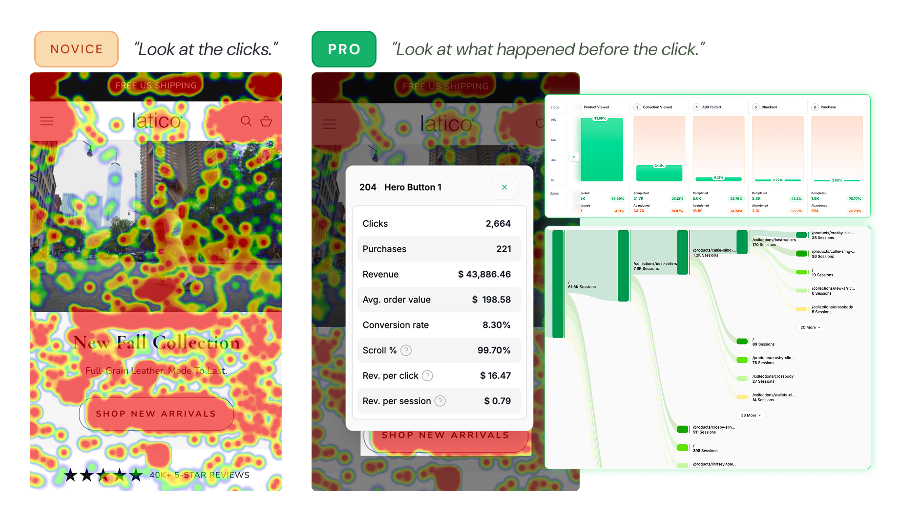
4. The novice move and the pro move
Here is where most people go wrong, and the error is subtle because the wrong answer is genuinely a reasonable answer.
You find the high-revenue FAQ buried in position four. The obvious conclusion: move it to position one. More people will see it. More people will click it. More revenue.
That is inference. It takes the observation and extends it in a straight line. It is also what every AI recommendation engine will tell you to do, because straight-line extension is what inference engines are for.
The pro move asks a different question: why is that item winning?
Not "how do I get more clicks on it," but "what does the fact that this specific item wins tell me about the person buying this product?" The answer to that question is a piece of consumer psychology. And once you have it, you are no longer optimizing an FAQ. You are holding a buy trigger, and the FAQ is just where you happened to find it.
That reframing is the difference between a cosmetic change that will produce nothing at scale, and the kind of insight that can produce a statistically significant +8% lift.
5. Our signature move: Detect → Interpret → Transform
Step 1 - Detect. Find an element with disproportionately high revenue per click relative to its siblings. Dropdowns under the buy box, FAQ items, variant selectors, size guides, spec tabs. Anywhere a set of comparable interactive elements sits together.
Step 2 - Interpret. Ask yourself, what’s in there that caused this dramatic difference in revenue per click. What is it that people care about, what’s the piece of information that got them to change their mind and buy? Or maybe simply reassured them? This is the part you shouldn’t outsource to AI, and really use your brain power.
Step 3 - Transform. Turn that insight into a new way of communicating the underlying buy trigger.
It might become a short product description, a USP, a comparison, a variant helper, a line of copy next to the CTA, or something entirely different.
This is the creative part.
Again, a novice would ask: “Where should I move this FAQ?”
A pro thinks this way: “Now that I understand why this matters to customers, what is the best way to communicate it?”
The output should fit naturally into the page and the brand’s creative direction, while making the insight available to more visitors, ideally earlier in their decision-making process.
The goal is not to transform the element.
It is to transform what you learned from it into a better hypothesis.
6. Why it works: the Gator never opens the dropdown
Heatmap's methodology describes two decision-makers in every visitor. The Gator is fast, instinctive and pattern-matching, it processes roughly 11 million bits per second and it is in control about 95% of the time. The Judge is slow and analytical, about 40 bits per second, and it only wakes up when something makes the visitor hesitate.
The Gator decides whether to stay in the first one to three seconds, and it is asking four questions: Is this what I wanted? Can I do this without thinking? Does this feel familiar and trustworthy? Is anything making me hesitate?
Now look at where your winning FAQ sits. It is below the fold, collapsed, behind a click. The Gator will never reach it. Only a visitor who has already scrolled, already hesitated, and already summoned the Judge will ever open that dropdown.
Which means your highest-revenue piece of information on the entire page is currently only available to the small minority of visitors who were engaged enough to go looking for it, and by the time they find it, you have already woken the Judge.
The idea is simple: take something that is already helping people buy, and make sure more people actually see it.
You’re not inventing a new argument or adding more copy just for the sake of it. You already know this piece of information matters because the people who interact with it are more likely to purchase.
So instead of leaving it buried in a dropdown that only a small percentage of visitors will ever open, you bring that idea into the part of the page everyone sees.
That’s where the lift comes from.
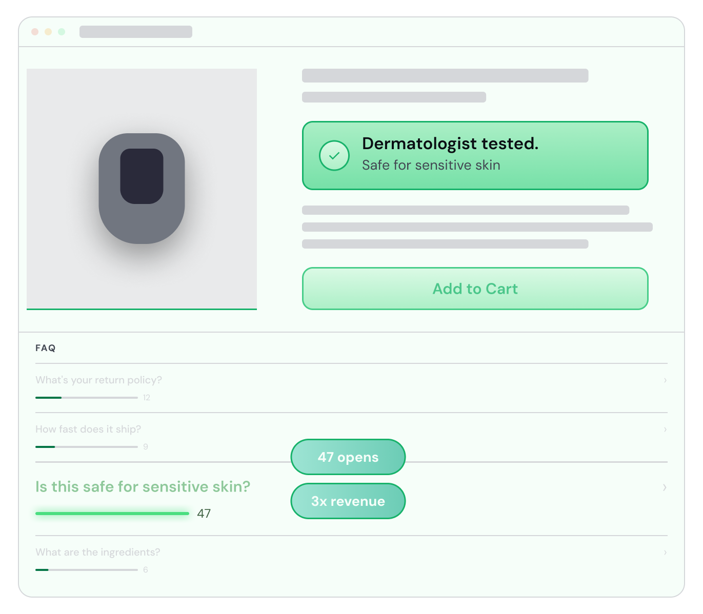
7. Case study one - The FAQ that revealed a USP people really cared about
One FAQ was generating 4–5x more revenue per click than the others. Turning that insight into above-the-fold copy led to a stat sig +9% in add-to-cart rate.
One of the brands we worked with sells toys for kids.
The product had a lot of different selling points: the age kids could start using it, the guarantee, the quality, the fact that it was durable, and so on.
Naturally, we were trying to communicate quite a few of them on the product page.
We also had an FAQ below the CTA giving more context around each of these points.
When we looked at the revenue attribution of those FAQs, one stood out immediately.
It was generating around 4–5x more revenue per click than the other questions.
And interestingly, it wasn’t necessarily the one getting the most clicks.
The question was around durability: parents wanted reassurance that their kid wasn’t going to break the product.
That told us something much more useful than “this FAQ performs well.”
It told us that durability was probably much more important in the purchase decision than we were giving it credit for.
So we didn’t move the FAQ higher.
We took the idea behind it and transformed it into a short piece of product copy directly below the variants, where every visitor could see it without having to scroll or open anything.
That test increased add-to-cart rate by 9%, with a similar lift in conversion rate.
It ended up being one of the best tests we ran for the brand.
And the interesting part is that we didn’t come up with a new selling point.
It had been sitting on the page the whole time.
8. Case study two - Two bestsellers, one unanswered question
The two bestselling variants represented most of the brand’s sales. One FAQ revealed that customers still didn’t fully understand the difference between them. Fixing that led to a stat sig +6% increase in conversion rate.
The second example came from a headwear brand.
Two variants were doing most of the volume.
One represented around 40% of sales, the other around 30%.
So together, these two options accounted for the large majority of what people were buying.
Below the CTA, the brand had a small FAQ accordion.
And one of the highest-performing questions was basically:
What is the difference between these two variants?
That was a pretty strong signal.
People clearly liked both products.
The problem was that they were similar enough that some visitors didn’t know which one to choose.
So this wasn’t really an FAQ problem.
It was a choice problem.
If someone is already interested in the product but can’t confidently decide between option A and option B, you’re creating friction right at the point where they should be making the easiest decision on the page.
We asked the brand’s customer service manager, and they had the same insight coming from customers.
Again, simply moving the FAQ higher wasn’t the answer.
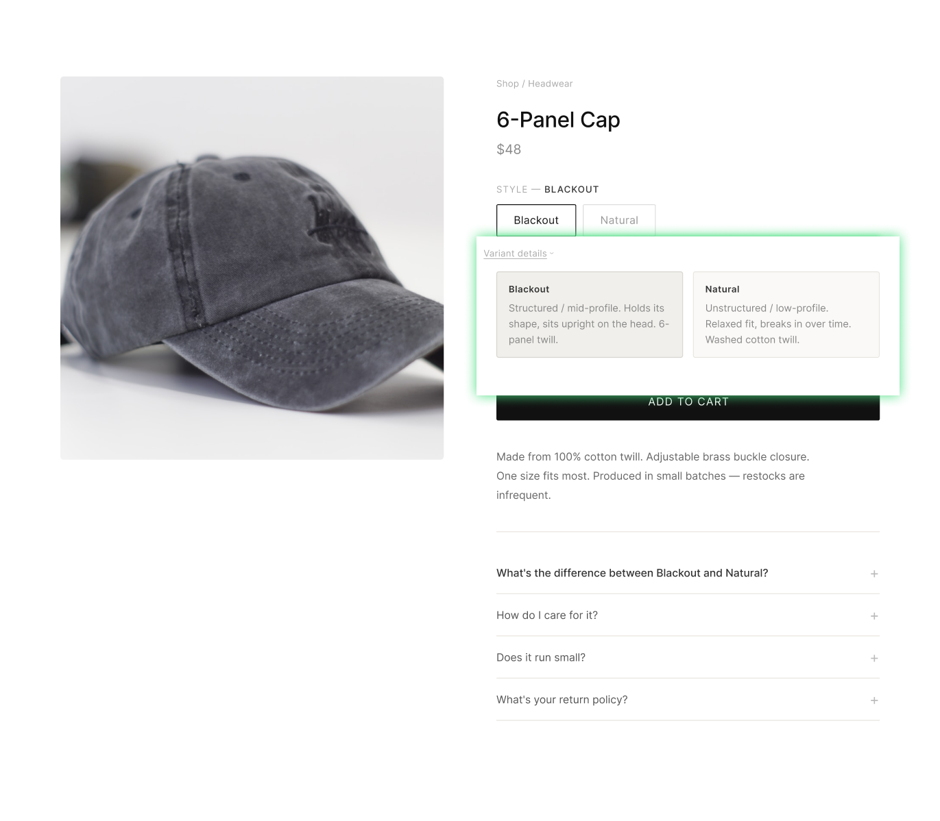
Instead, we added a very small “Variant details” element above the fold.
Visitors could click it and immediately see a short explanation of the difference between the two options.
Nothing flashy.
That was important because the brand has a very minimal aesthetic. The website almost looks deliberately unoptimized, and adding a big comparison table, badges, or a bunch of CRO-looking elements would have completely missed the point.
The test increased conversion rate by 6%.
And most visitors probably wouldn’t even notice that we had “optimized” anything.
That’s something I think CRO teams often forget.
The goal isn’t to make the optimization visible.
The goal is to understand the problem well enough that the solution feels like it was always supposed to be there.
9. The pattern underneath both
Two different brands, two different categories, two different psychological mechanisms, durability reassurance in one case, choice paralysis in the other. Same three steps, and in neither case did the winning change involve moving just the FAQ element that produced the insight.
That is to tell that you are doing cognition rather than inference. Inference relocates the element. Cognition relocates the meaning.
It also explains why this play is hard to copy and easy to teach. The detection step is mechanical, any competent analyst with revenue attribution can find the outlier in a few minutes.
The interpretation step is where agencies separate, and it does not come from a tool. It comes from being genuinely curious about why people buy things.
10. How to run this on your own site
Where to look first. Accordions and dropdowns directly under the Add to Cart button. Then FAQ blocks further down the page. Then any other set of sibling interactive elements: variant selectors, spec tabs, size guides, shipping and returns toggles.
The detection rule. Sort the sibling set by revenue per session, not by clicks only like you would do with Clarity or Hotjar. You are looking for a meaningful delta between items, on the order of 30% or more. Ignore click volume entirely at this stage.
The volume gate. Set a minimum traffic threshold before you act on any of this. If ten people saw the section, the delta means nothing. On pages where scroll depth is very shallow, an FAQ near the footer may never reach significance no matter how much traffic the site gets. Check that the section itself is getting real interaction before you trust the ranking inside it.
Validate before you build. Revenue attribution tells you what is winning. It does not tell you why, and your first interpretation is a hypothesis, not a finding. Post-purchase surveys are the cheapest way to confirm you have read the psychology correctly before you spend design and dev time on it.
Respect the creative direction. Write down the brand constraint before you design the treatment, not after. The transformation has to look like it was always part of the brand.
Then test it properly. This is a real test with a real hypothesis, so run it as one, proper sample sizing, a metric you agreed on before launch, and the discipline to log it whether it wins or loses.
11. The part AI cannot do for you
A closing thought, because it is the reason this play still has an edge.
Right now, most CRO teams are prompting the same models with the same questions, which means ten different agencies produce the same ten recommendations. If the output of your process is something anyone with a subscription could have generated, you are not doing analysis. You are doing retrieval with extra steps.
The tools are genuinely getting better at detection. Finding the outlier in a set of siblings is exactly the kind of work that should be automated, and it will be. What does not automate is the step in the middle: looking at a number and asking what it says about a human being who was on their phone, three seconds into a page, deciding whether they trusted you.
Everything in e-commerce still comes down to people, emotions, needs, desires, hesitation. Any analysis that skips the human on the other end of the data is guessing with better formatting.
The data gets you to the buy trigger. You still have to know what to do with it.
.png)
If you’d like Andy and his team to take a look at your store and see where opportunities like this might be hiding, you can book a quick chat here.

Read Related Articles
You made it all the way down here?
Might as well give us a shot, right? It'll change the way you approach CRO. We promise. In fact, our friend Nate over at Original Grain used element-level revenue data from heatmap to identify high-impact areas of his website to test, resulting in a 17% lift in Revenue per Session while scaling site traffic by 43%. Be like Nate. Try heatmap today.
