A visitor lands on your product page. Over the next twenty seconds they read your headline, look at the hero image, scroll past your shipping badges, stop at your reviews, scroll back up to check the price, hover over the Add to Cart button, and leave.
Your analytics recorded one thing from that visit: a bounce.
Everything that actually happened — the reading, the comparing, the scrolling back, the pause over the button — produced no event. And so the standard CRO workflow ends up optimizing the narrow slice of behavior that happens to be measurable, and guessing at the rest.
That’s the gap the Attention Map is built to close. Here’s a short walkthrough of the report before we get into the detail:
The decision happens before the reasoning does
The Gator processes about 11 million bits per second. The Judge processes about 40. That’s the fast, instinctive, pattern-matching part of the brain against the slow, analytical part — and it’s a 275,000× gap.
On a landing page, the Gator has usually decided whether to stay within one to three seconds. The Judge barely has time to finish the headline. Which means the great majority of what determines whether a page converts happens in a window where nothing is clicked, nothing is submitted, and nothing is logged.
Then, if the Gator stays, the second phase begins: reading, comparing, looking for the reason not to buy. That phase produces almost no events either. It produces dwell. It produces hover. It produces hesitation.
Those are exactly the things nobody was measuring.
What scroll maps and click maps can’t tell you
Scroll depth answers one question: how far down the page did visitors get?
That sounds useful until you try to make a decision with it. Because it silently blends two completely different questions:
- Did people reach this section?
- Did it matter that they did?
A section at 60% depth reached by half your visitors could be the most persuasive block on the page or a dead zone people scrolled past on their way to the reviews. Scroll depth reports both identically. Move the wrong one and you’ve spent a testing cycle for nothing.
Click maps have the opposite problem. They’re precise about actions and blind to consideration. A button with a low click rate might be poorly positioned, poorly worded, or perfectly fine and attached to an offer nobody wants. The click map can’t distinguish between “nobody saw it” and “lots of people saw it and decided against it,” and those two findings point at completely different fixes.
Time on page, meanwhile, mostly measures whether a browser tab was open.
What we built
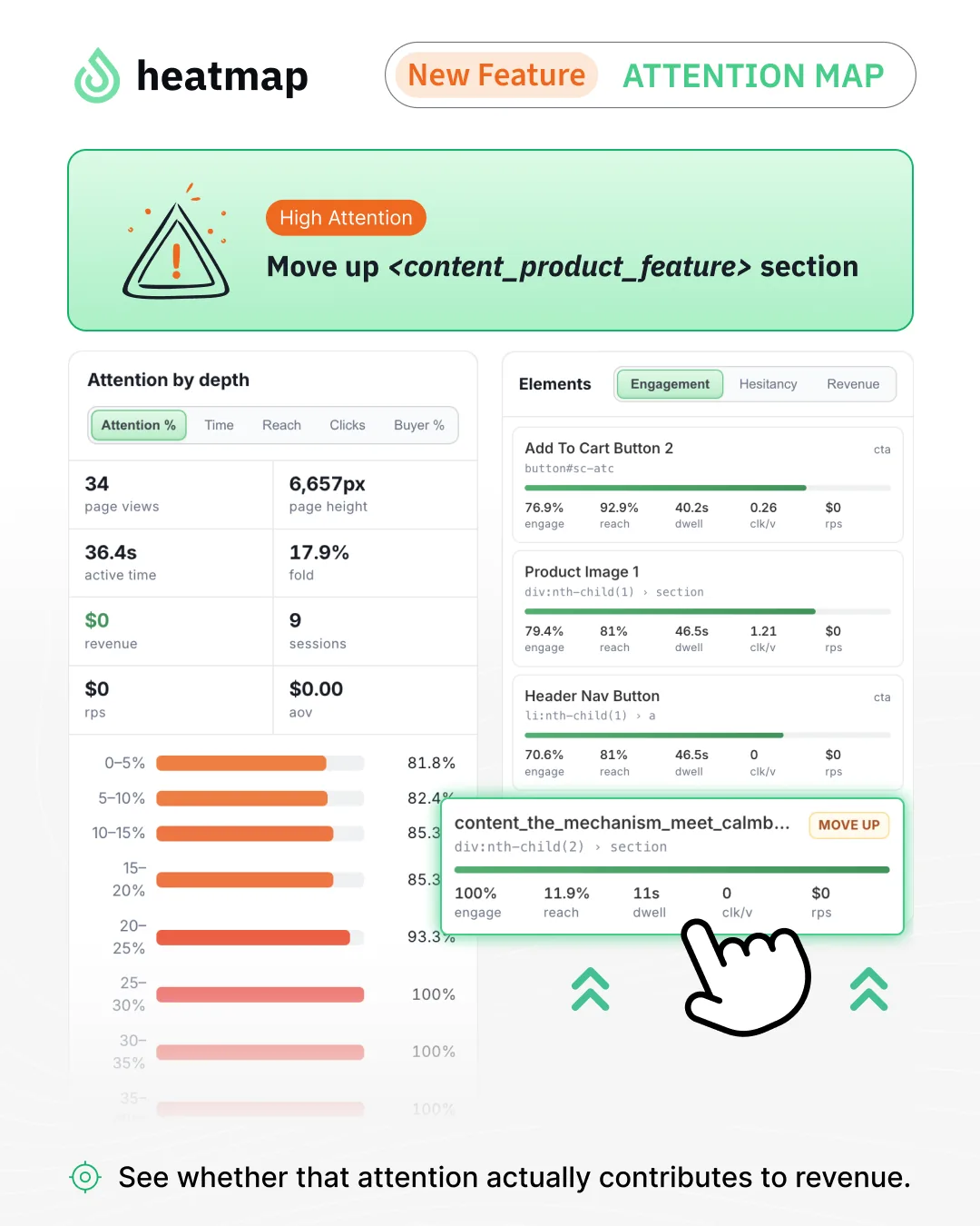
The Attention Map divides your page into 20 bands, each 5% of the page height, and measures attention in each one. Not scroll position — attention. How long the content was genuinely in the viewport, on a visible tab, with an active visitor. Hover time. Click timing. Whether the visitors who reached it went on to buy.
The two headline metrics are deliberately separate:
- Reach % — how many visitors got this far.
- Attention % — of the visitors who reached it, how many actually had it in view long enough to take it in.
Splitting those two apart is what makes the report actionable, and the combinations tell you what to do:
ReachAttentionWhat it meansHighHighThis section is earning its position. Leave it alone.HighLowPrime real estate returning nothing. The section isn’t working, or isn’t communicating fast enough to register on the way past.LowHighThe best finding in the report. Proven content in a position almost nobody reaches.LowLowBelow the fold and not missed. A candidate for removal.
Alongside the depth view, the Attention Map tracks the elements on the page — up to twelve of them, detected automatically — with engagement, dwell, and same-session revenue for each.
Hesitancy is the metric we didn’t know we were missing
One element-level number has turned out to be more useful than the rest.
Hesitancy measures how long a visitor’s cursor sat on an element before they clicked it, measured only among the people who clicked.
Read that constraint again, because it’s what makes the number so pointed. Hesitancy is your converting visitors slowing down. If the people who eventually said yes needed several seconds of hovering to get there, the people who said no almost certainly hesitated longer before they left.
Picture a product page whose primary CTA comes back with a median hesitancy in the region of fifteen seconds. Nobody is confused about where the button is. It’s visible, it’s contrasted, it’s above the fold. Fifteen seconds of hovering is not a design problem. It’s a visitor reading the button, not knowing what happens after they press it, and looking for reassurance that isn’t on the page.
That’s a copy and offer finding, arrived at from a hover metric. You would never have found it in a click map, because the click eventually happened.
And now: what the design tells people to look at
This is the part that shipped this week.
The Attention Map now includes a predicted attention view alongside the measured one. It models where attention will land based on the visual design of the page alone — contrast, size, position, faces, text density — with no visitor data involved at all.
Two views of the same page: what your design is inviting people to look at, and what your visitors actually did.
Analyzing either one on its own is slower than analyzing the gap between them, because the gap comes with the diagnosis attached:
Predicted high, measured low. The design is drawing the eye to something visitors don’t care about. The page is well-built and pointed at the wrong thing. This is a relevance problem, and it usually means the message doesn’t match the intent of the traffic arriving on it.
Predicted low, measured high. Visitors are hunting for something the design is hiding. They are already looking for it and finding it anyway, through effort. This is the fastest improvement available on almost any page: stop making them work for the thing they’ve already decided they want.
The second pattern is the one to look for first. Demand that survives bad design is the cheapest demand you will ever service.
Three findings to go looking for
The buried winner. Sort your depth bands by attention and look at the reach column. A band with strong attention and weak reach is proven content sitting where nobody goes. Moving it up is about as close to a low-risk test as CRO offers, because you’re not changing the content — only who gets to see it.
The pattern often shows up in footers. A block reached by a small fraction of visitors, where nearly all of those who do reach it engage with it, is telling you something about what your buyers want to know and where you’ve chosen to put it.
The hesitation cluster. Sort elements by hesitancy. Look at what the top few have in common. If they’re all price-adjacent or all guarantee-adjacent, you’ve found the objection your page isn’t answering.
The buyer/non-buyer split. Filter the depth view to buyers, then compare it against everyone. Bands where buyers engage far more than average are doing the persuading — protect them, and consider moving them earlier. Bands where the two groups look identical aren’t differentiating anyone.
What it doesn’t do
Worth saying plainly, because a measurement tool that oversells itself costs you more than one that doesn’t exist.
It doesn’t prove causation. Element revenue is same-session attribution: revenue from sessions that engaged with an element and then purchased. That identifies elements on the path to purchase. A split test is still what proves that changing one caused the difference.
Hover metrics are desktop signals. Float and hesitancy depend on a cursor, and touch devices don’t have one. On mobile, work from dwell, reach, attention, and clicks.
Depth percentages won’t match your scroll report exactly. The depth view deliberately aggregates only visitors who saw a comparable version of the page, so that averaging someone who saw a 4,000px page with someone who saw a 12,000px one doesn’t produce a meaningless number. That’s a feature, and it means the two reports answer different questions.
Small elements need volume. Elements are reported once at least five distinct visitors have seen them. Below that, the numbers are noise dressed as insight.
Where to start
Open your highest-traffic page. Look at two things before anything else: the band with the highest attention and the lowest reach, and the element with the highest hesitancy.
One of them is content you already own that most of your visitors never see. The other is a sentence you haven’t written yet.

Carina MunroPublished September 6, 2026